I also use a lot of house rules for hexcrawling in an inverted jungle in the dreamlands, and I want the character sheet to intuitively convey some of that information. So there is an information design angle too. Another question I have is how to combine those two things. How do you get killer aesthetics along with sleek information presentation?
But I realized that I had never taken character sheets seriously before, so I had few models to show my designer, Matt Hildebrand, to give him a sense of what I wanted. So I turned to twitter for help. The results were pretty great, and I'm here to share the wealth with you.
First, the two I posted to get us started. I began with one of Logan Knight's character sheets for his house-ruled LotFP game, Cörpathium. Note that in general I'm using mainly lousy screen shots here, and linking to the sites in question so you can get the originals from their source.
I love this sheet. It's beautiful, with the central esoteric icons, and the elegant flanking circles for ability scores and saves, with the ghostly bubbles for mods. That whole shebang is held in place by the orderly lines above and below. But this character sheet also shines in terms of information design. Logan has a lot of house rules, and they're elegantly represented on sheet. For example, there's the reminder for combat options, and the dices with bubbles for skills (including two blank ones for extra skills), making clear how that subsystem works. You can get it here, and if you haven't check out Logan's blog, Last Gasp Grimoire, you need to rectify that right now.
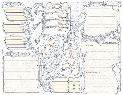
The second sheet I put out there is for a game I've never played, Numenera. When I was designing the White Jungle, I did look at the bestiary once for inspiration on alien beasts. While not every entry was a home run, it was pretty interesting. But check out this character sheet:
I mean, holy hell! The sheet immediately conveys a weird future vibe with esoteric undertones--the kind of game where you might scavenge alien artifacts used by mechanized angels in some apocalyptic ancient war. I love the way the different parts of the character sheet are connected by illustrations of orbs, chains, gears, and biological bits, like that wonderful eye peaking out of a triangle. The design of a fractured circle with the stats in the middle, and the way the skill section somehow looks like triple mechanical wings is amazing.
Here are two sci-fi character sheets that people posted that stand out for their information design, one for Mothership by Sean McCoy, and the other a redesign of a simplified D6 Star Wars character sheet by Jez Gordon.
This sheet explains everything you need to know to both create and play the character. Mothership is, for a rules light game, on the complicated side. If you look closely at the character sheet, you'll see that it's actually designed as a flow chart to follow. By following the arrows, the sheet itself walks you through a kinda fiddly character creation. Somehow it manages at the same time to look like an array on a control panel in some 1980's imagined future. While brilliantly focused on information design, it also conveys something about the aesthetic and implied setting. Nice.
The simplified d6 star wars sheet is another tour-de-force of information design. Jez designed it for kids with autism, like his 9 year-old son, who do better with a more visual presentation. It's charming, with an adorable star wars icon for absolutely every stat. Maybe it's not appropriate for every game, but if you wanted to play a beep-blooping droid who is a buddy cop to a Mon Calamari Jedi, then this is the sheet for you. It also has simple char gen rules in the fine print at the bottom. (Check out his blog Giblet Blizzard here if you don't already know it. It's a treat.)
Bruno Prosaiko's character sheets are in a class all their own. Check out this character sheet for DCC zero level funnels. (A good scan is available for PWW on DTRPG here.)
That your scores, weapon stats, and so on are written on coiling demon snakes is fantastic. That they're coming out of a 3d box, and that you write you stuff on one side of the box, and money and XP on the other takes it to the next level. Sure, it's a gimmick, but it's pulled off with such panache. Also, it's 100% true to the DCC aesthetic. Having this sheet in front of you would be enough to put your head into the right space from the first minute you butt hits the seat. Also check out these PC and vehicle character sheets by Prosaiko for Solar Blades and Cosmic Spells:
It's the same gimmick, with an elegant design where you're invited to scrawl all over a picture that puts you in the right mood straightaway. It's a different game with a different aesthetic, but it's works just as well.
Speaking of gimmicks here's another class of character sheets folks shared, where the sheet is ostensibly an artifact in the game. For example, here are two character sheets designed as antique passports. The first is for Megamountain Deathcrawl by Slantio. The second is Jez Gordon's design for Hollow Earth Expedition.
Another genre of character sheet that can be lovely is what I think of as the bespoke, hand-drawn character sheet that hews more or less to the original layout but embellishes it with an artist's sensibility. Here are some nice exemplars of that type. The first is by Gus L of Dungeon of Signs fame. (And a collaborator on Through Ultan's Door.) You can find it here.
What it lacks in ease of information it makes up in spirit in spades. The fact that you write charisma on smiling white teeth, intelligence on the cranium of an alien skull, and inspiration in a flickering flame, combined with the densely packed illustration make this visually arresting.
This two page B/X character sheet by Dyson is simpler, but quite elegant. You can get it, along with a ton of his other character sheets here.
There's a lot to like about this character sheet. While hewing to more or less traditional layout, it has the clever touch of having you write many things on a curling ribbon. The portrait in the skull-topped mirror is good too. The whole thing has a B/X fairy tale vibe that speaks to me. While I'm talking about Dyson's character sheets, I have to put before his Empire of the Petal Throne character sheet, just because it's my favorite game that almost no one plays. I like his use of Tsolyani script, and the way he let's it bleed over into the shapes of the spaces for stats:
Since I'm not planning (at present) on using a gimmick like these, or even like Prosaiko's delightful schtick (but honestly, shouldn't I ALSO commission a character sheet from him?), more directly relevant for my purposes are some character sheets that are very simple but aesthetically on point. Keep in mind that I know little about these games. Let's start with this neat one from Spirit of the Century.
No, I haven't ever tried Fate. So I have no idea what's really going on here. But I love how they manage to layout all the information as a series of concentric circles. It also has a great pulpy feel, as if the whole character sheet were a Jack Kirby Dr. Strange amulet. Pow! Blam! I will defeat Gorilla Khan with my ray gun and whip.
As long as we're talking about the innovative use of circles, check out this character sheet for 4th edition D&D. It's an edition I never played. There is an equally complicated back side to the sheet as well. I found it here.
I love how the character sheet does everythign with circles. Together they look like floating bubbles , or perhaps planetary bodies in some astrological chart, or maybe even some kind of enlarged cellular structure. In any case, it's definitely arresting and creative in its execution.
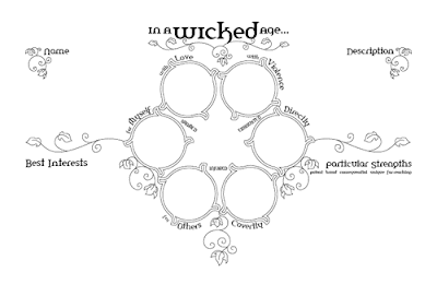
More relevant for my less informationally dense nefarious purposes are these two character sheets from In a Wicked Age, a game written by Vincent Baker, who has designed an extraordinary number of very good games.
These are gorgeous character sheets. The Art Nouveau mix of circles and crawling vines is pretty. The layout is innovate too on both versions. Since the aesthetic of Zyan is heavily influenced by Art Nouveaux (among many other things) this spoke immediately to me. And since the White Jungle character sheets should probably have some vines and flowers on them, it's doubly relevant. I was surprised to learn that In a Wicked Age is a sword and sorcery game, since this aesthetic doesn't read that way to me at all. But I dig Baker's stuff and the Sword & Sorcery genre, so I'll be checking it out.
As long as we're talking about circles, who could ignore this beauty from Shadow of the Demonlord?
OK, what did I take away from all this? Mainly it was fun to see what other folks were up. But, if I had to draw lessons, here are a few.
- Landscape orientation has serious potential. The Numenera, Spirit of the Century, Empire of the Petal Throne, and In a Wicked Age character sheets show just how striking changing up the orientation can be.
- Circular designs are underutilized. Spirit of the Century, In a Wicked Age, Numenera, and the 4E sheet all employ circular design elements in unexpected ways to striking aesthetic effect. Even if we're playing variants of the oldest RPG, we aren't beholden to the columns of circles for stats and saves, or the pentagons for AC, and all that. Think in other geometric arrangements of shapes. Space can be divided in infinite arrays of tessellated geometrical divisions. Don't fear the curves.
- If those delightful Prosaiko sheets teach us anything, it's that it can be aesthetically pleasing to imagine possibilities other than writing on top of a line, or in a straight row of circles. Any enclosed white space can be designed as the receptacle of information about the character. Don't be afraid to have the players write on top of a figurative drawing, or on the teeth of a smiling mouth, or on a curving ribbon that winds its way through the character sheet.
- The Star Wars, Cörpathium, and especially Mothership sheet shows us how much information design you can actually fit on the sheet.
- Consider making rules legible on the character sheet in a variety of ways. The innovation of the Mothership char gen flowchart stands out here as especially creative. Also the Star Wars and Cörpathium sheets that shows you at a glance what kinds of dice you need to roll on a stat, and maybe what number you need to hit to succeed. The Cörpathium sheet shows that something as simple as including house rules in a box can look good too.
- It's possible to both have killer information design and convey the look and feel of your game. It may not be easy, but the aesthetic sensibility of a game can be conveyed in a form that is also super usable. Corpathium, Jez's Star Wars, and Mothership all do it.
Special thanks to @chthonstone, @JasonAbdin, @wldenning, @heckmueller, @DonoghMC, @kurpotts, @GibletBlizzard, @ItsDanPhillips, @NateTreme, @ossianboren, @superbigrobot, @umbral_aeronaut, @fabneme, @hawklord2112, @rudyriot, @scarvis, @jtkercado, @slantio1, @GameDevTeacher, @wrpigeek. If you use twitter, follow them all!
Addendum: In the comments, Gus pointed out that the sheet of his I link above was a send-up, putting a British Punk spin on the very different aesthetics of 5E. But in his comment, he also drew attention to many of his other character sheets that are character specific. This brings up a whole other class of individualized sheets with character portraits that really deserve some blog space. Since this was less relevant for my purposes, I didn't think to include it. But it definitely belongs in this post.
So let's start with Gus' sheets. Here's one for his longest running PC, Beni Profane the ratcathcer, in Brendan S.'s old Pahvelorn game from the early days of G+. You can learn about Beni and see several iterations of his sheet here.
Here's one he did of Brendan S's character Zoad in the Dungeon Moon Campaign by Nick of Papers and Pencils blog, and also a blank do it yourself sheet for use with LotFP.
In this same vein, here is one iteration of the character sheet of Nick Kuntz' long running FLAILSNAILS character Magic Meryl. Check out how the stats are in the flames of burning candles that surround her most metal incarnation:
And this is was a commission, I think:
You can see some of the same design elements from Logan's Cörpathium sheet.
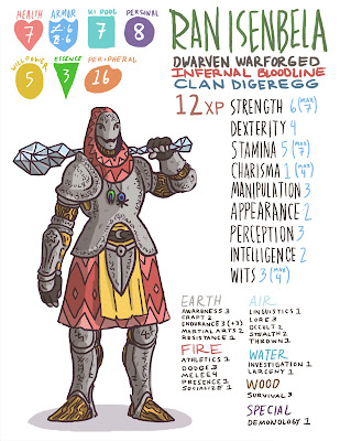
Here's one by Sam Mameli who takes commissions for character sheets. It's a 5E warforged. You can check out his Patreon here.
A more polished, less artisanal, but quite nice version of this genre from the RPG hello, world, a Forged in the Dark sci-fi game about memory collectors in a post-scarcity world. is the following sheet for the Blade character:
If you have a beloved character sheet, of any of these varieties, or do commissions for character sheets, please post in the comments below with links!
Addendum 2: Check out this cool character sheet that Emmy Allen made for use with the incomparable Gardens of Ynn!
Addendum: In the comments, Gus pointed out that the sheet of his I link above was a send-up, putting a British Punk spin on the very different aesthetics of 5E. But in his comment, he also drew attention to many of his other character sheets that are character specific. This brings up a whole other class of individualized sheets with character portraits that really deserve some blog space. Since this was less relevant for my purposes, I didn't think to include it. But it definitely belongs in this post.
So let's start with Gus' sheets. Here's one for his longest running PC, Beni Profane the ratcathcer, in Brendan S.'s old Pahvelorn game from the early days of G+. You can learn about Beni and see several iterations of his sheet here.
Here's one he did of Brendan S's character Zoad in the Dungeon Moon Campaign by Nick of Papers and Pencils blog, and also a blank do it yourself sheet for use with LotFP.
In this same vein, here is one iteration of the character sheet of Nick Kuntz' long running FLAILSNAILS character Magic Meryl. Check out how the stats are in the flames of burning candles that surround her most metal incarnation:
Here are a couple of nice ones by Logan Knight. The first is from Mateo Diaz Torres' Flowerland game
And this is was a commission, I think:
You can see some of the same design elements from Logan's Cörpathium sheet.
Here's one by Sam Mameli who takes commissions for character sheets. It's a 5E warforged. You can check out his Patreon here.
A more polished, less artisanal, but quite nice version of this genre from the RPG hello, world, a Forged in the Dark sci-fi game about memory collectors in a post-scarcity world. is the following sheet for the Blade character:
If you have a beloved character sheet, of any of these varieties, or do commissions for character sheets, please post in the comments below with links!
Addendum 2: Check out this cool character sheet that Emmy Allen made for use with the incomparable Gardens of Ynn!


So that 5E sheet up there was pretty much a joke. A laugh at doing 5E in the most 90's Warhammer/Blanchitsu way I could imagine.
ReplyDeleteMy actual character sheets look like this (including a blank):
https://dungeonofsigns.blogspot.com/2014/05/dungeon-moon-character-progression.html
The last sheet I've drawn up specifically for a thing is this one though - it only makes vikings:
https://dungeonofsigns.blogspot.com/2017/07/hms-apollyon-viking-character.html
Here's the ones for my longest running G+ campaign PC.
https://dungeonofsigns.blogspot.com/2014/05/pahvelorn-character-sheet-collection.html
Oh man what riches are in those links!
DeleteI couldn't find Jez's simplified character sheet for SW D6. Could you perhaps link to the sheet?
ReplyDeleteI don't think it's been published anywhere. Try this tweet: https://twitter.com/GibletBlizzard/status/1141730085247934464
DeleteDid these a little while back: http://bearded-devil.com/2019/10/31/hex-character-sheets/
ReplyDeleteThose are glorious!
DeleteI've played Numenera, and the character sheet you have linked here is worse than useless. Sure, it's pretty, but there's not enough room for the information and it's just plain TOO ornate. Players are baffled by it and it's impossible to find anything you're looking for. They used to sell an upgraded character sheet as either a PDF or as physical booklets, and it was MUCH better. In V2 of the game, which came out this year, they just ditched the ornate version and replaced it with a new one based on the upgrade-version entirely (and everyone who has to actually use it rejoiced).
ReplyDeleteLove for character sheets is one of the reasons I got into D&D. Thank you!
ReplyDelete